



Article
Behind-the-Scenes: F+H Partners Brand Refresh
October 2026 · Parth Shah • 5 Min Read
We add value through our collaborative and hands-on approach. We don’t really believe in coming in, handing over a report, and walking away. We work in the spirit of partnership for customized, real-world solutions.
This conversation from my first meeting with Amy and Peter stayed with me, as I set out to work on F+H Partners’ brand refresh. As the firm settles into its third year, it was the right time to take a fresh look at how they were showing up visually. The goal was to have a visual presence which better represents the F+H Partners today and where they are headed next.
A logo that feels more approachable
We want every organization to feel welcome; we love working with different clients.
Peter and Amy were certain about an inclusive and accessibility-forward identity from the get-go. One of the biggest opportunities was the logo. The previous mark had a good foundation, but there was room to make it feel more welcoming, screen-friendly, and accessible.

The new logo simplifies the visual language and gives the identity a cleaner, more contemporary feel. It is designed to be easy to recognize and, importantly, easy to use — whether it appears on a website, presentation, social media, or a small digital application.
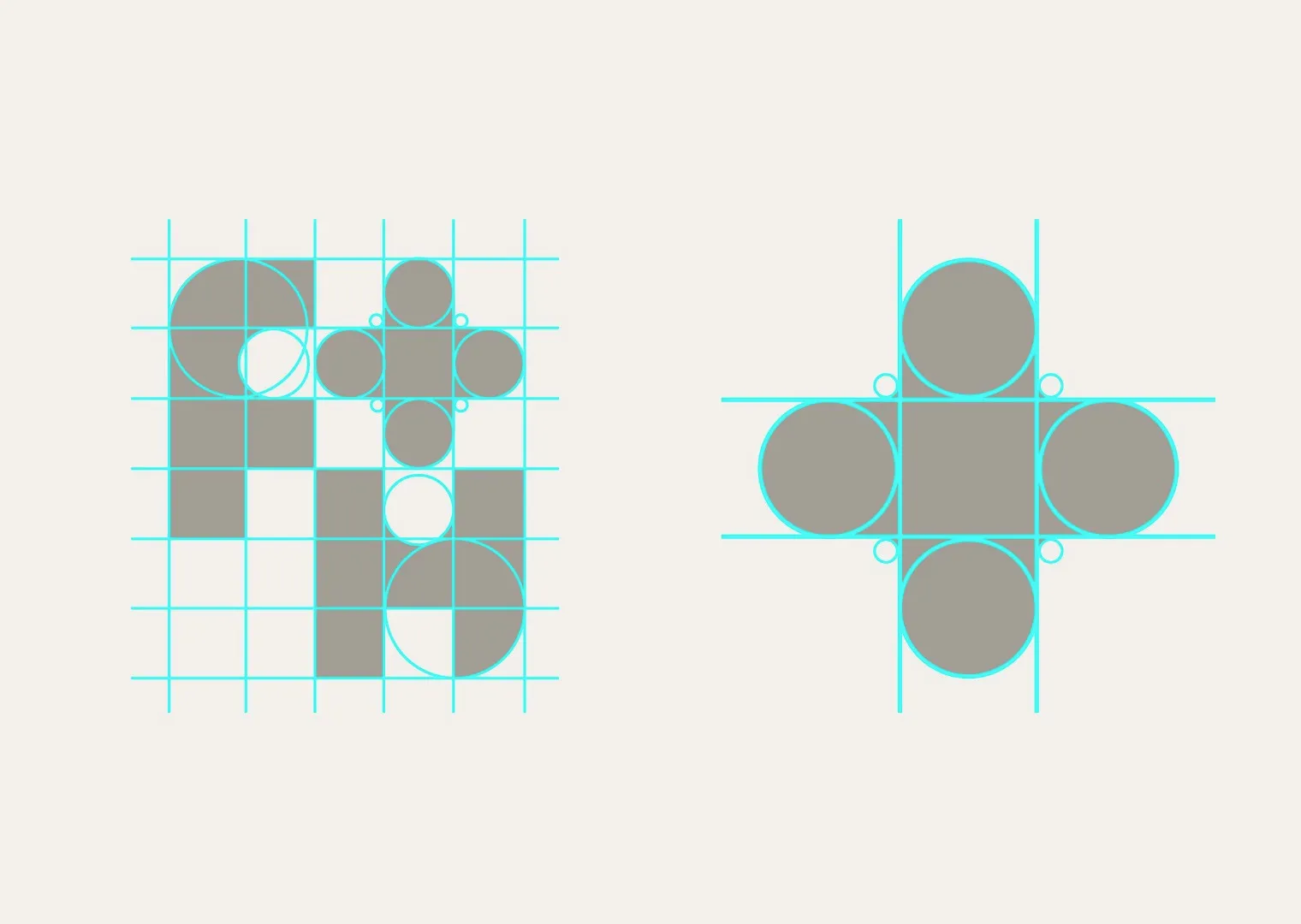
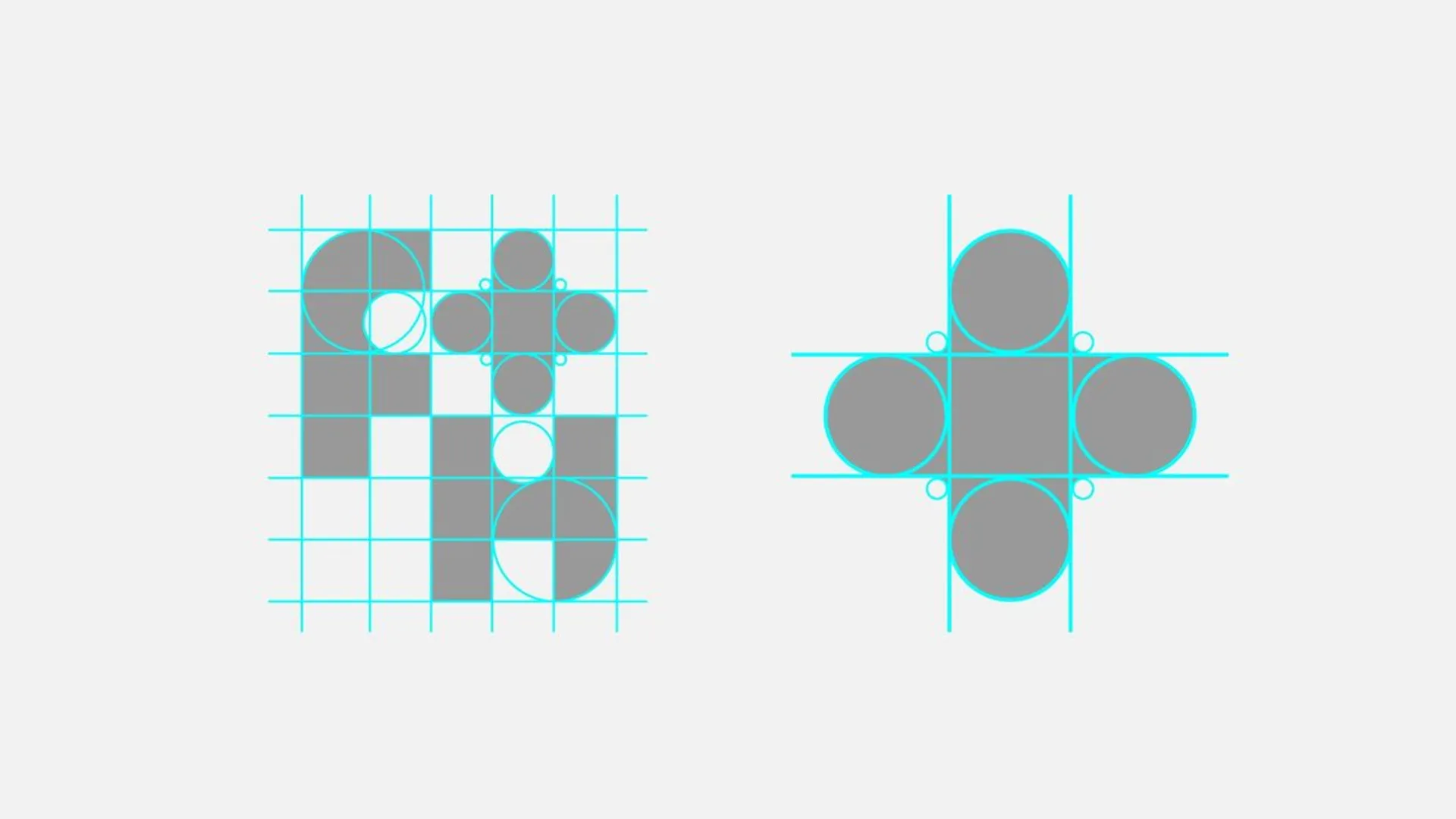
What makes the core of the new mark for F+H Partners is its symmetry. Set on a 5x6 grid, divided mostly in squares and circles, when all parts of it comes together, we have a logo which looks robust, beautiful and friendly. An identity that feels less formal and more approachable, while still carrying the credibility you'd expect from a firm with deep frontline fundraising expertise. This also aligns beautifully with the firm’s core philosophy of different people and different ideas coming together to make something beautiful.
Building the identity around collaboration
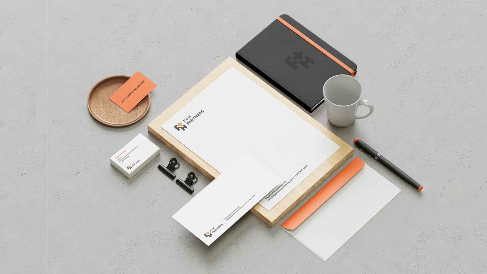
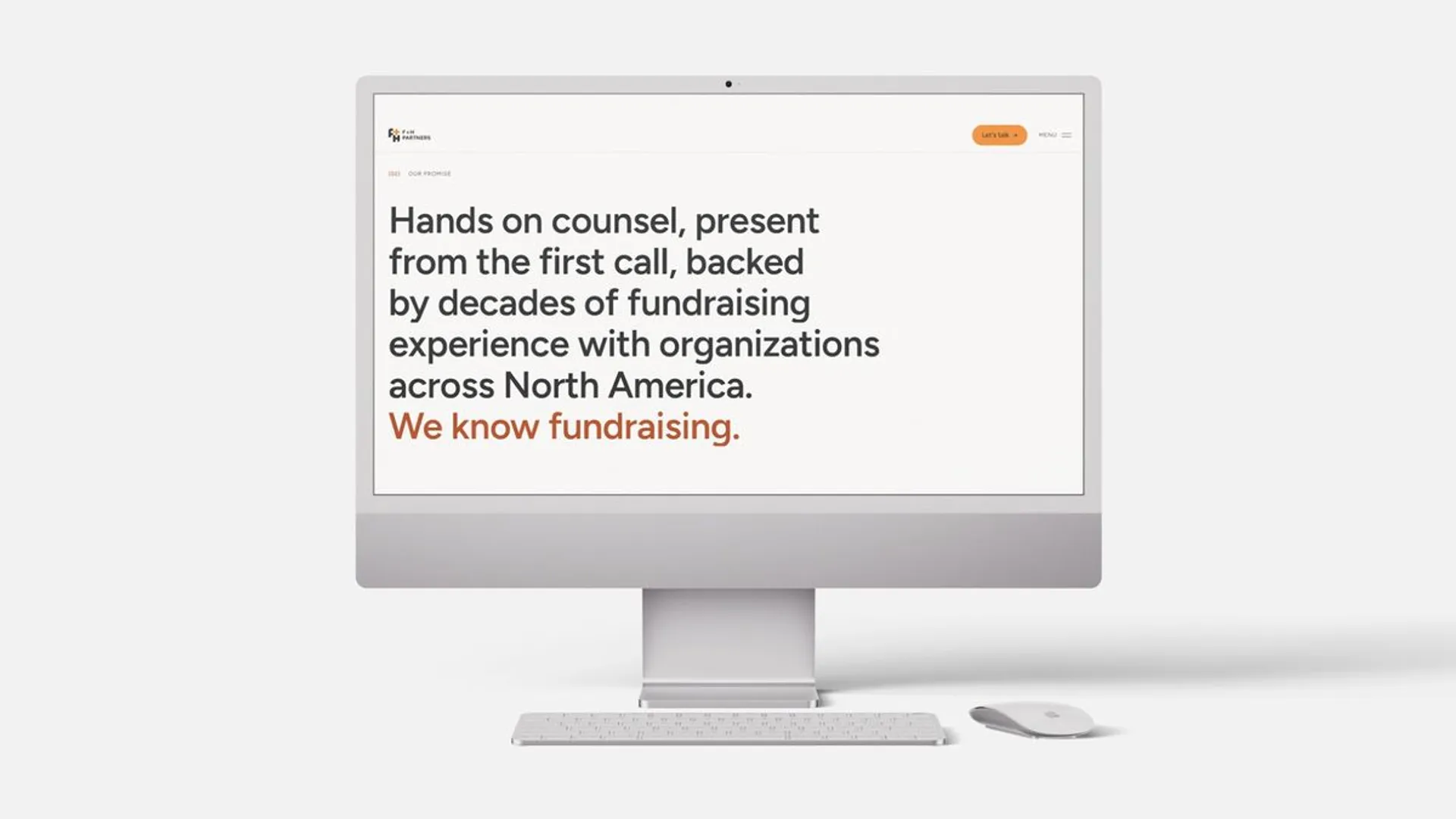
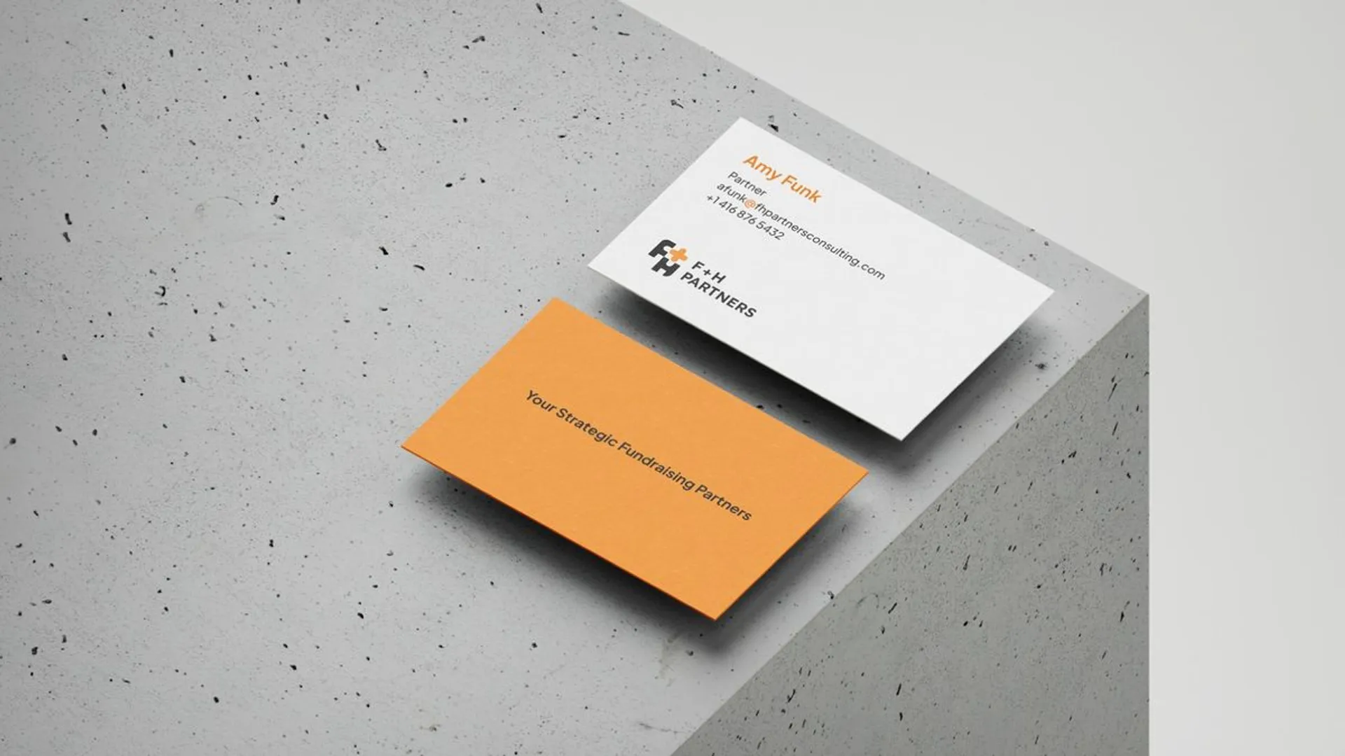
From there, the refresh expanded beyond the logo into a broader visual identity. Color, typography, graphic elements, imagery, and layout were all reconsidered as parts of the same system. A good logo sets the tone but then there are all the other visual elements which have to come together to really make a coherent statement. In this case, the sum of the parts is greater than the whole.
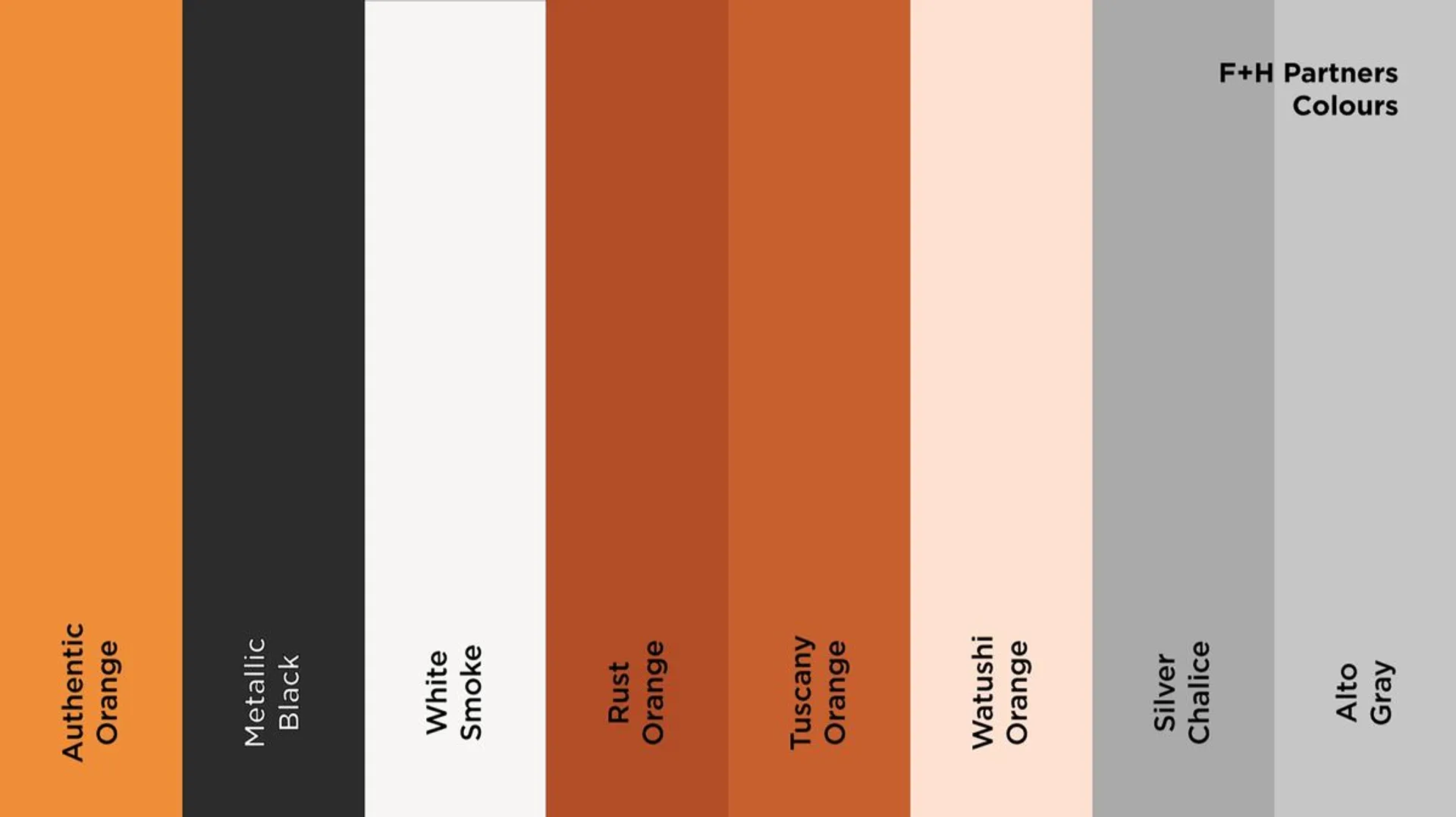
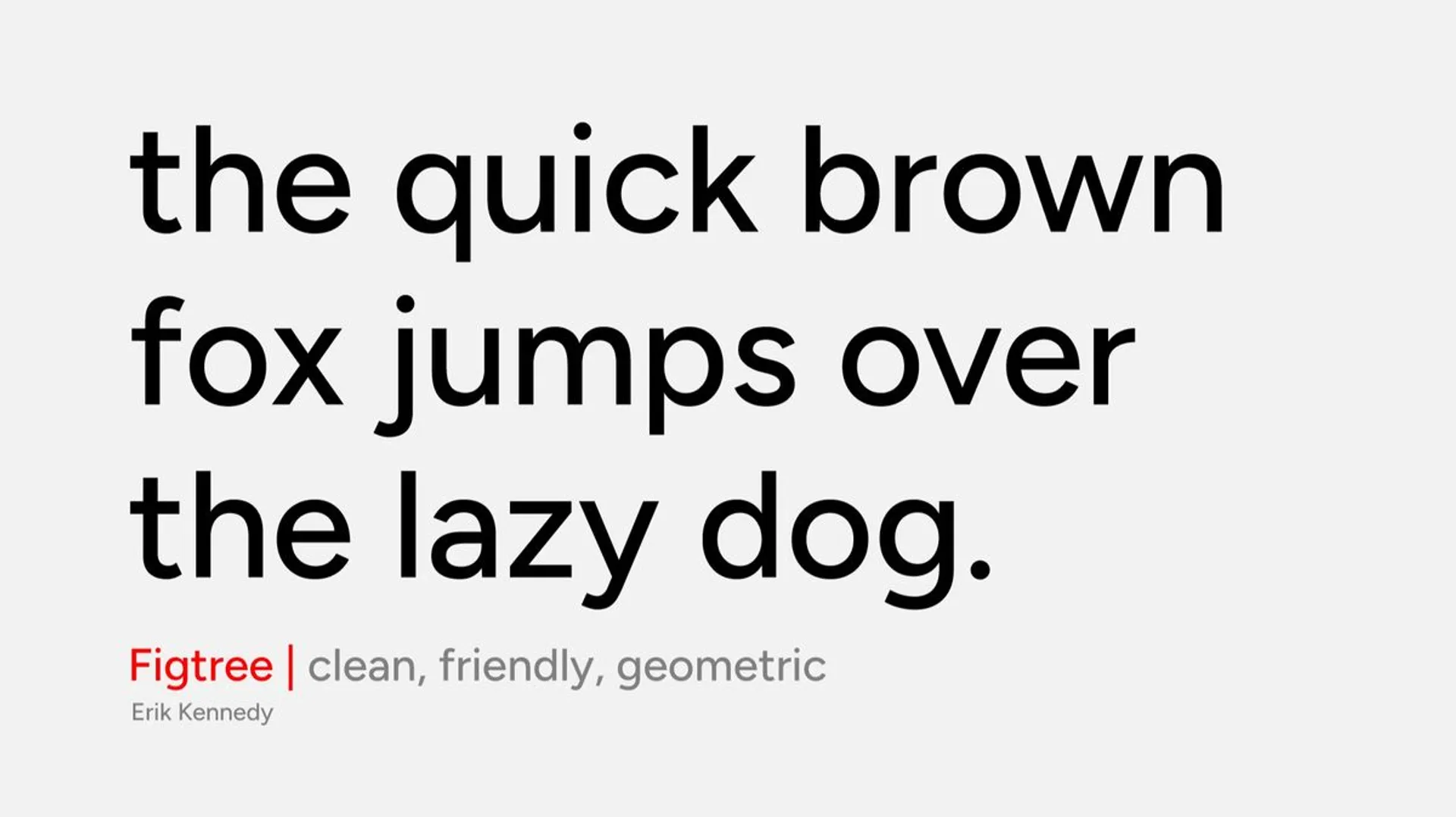
I wanted the identity to have enough structure to feel professional and established, but not so much that it became rigid or corporate. That balance felt particularly important to bring Peter and Amy’s vision to life. The visual system is therefore designed to be flexible and adaptable — much like the firm's approach to consulting.
Evolving, not starting over
For me, the most important part of this project was making sure the new identity felt like them. A rebrand doesn't always need to mean starting from scratch. Sometimes it's about recognizing what is already there, understanding what has changed, and creating an identity that catches up with the business.
For F+H Partners, this refresh marks that next step: a more polished, accessible, and cohesive identity that reflects the way they work — collaboratively, practically, and with a deep understanding of fundraising from the inside out.
Work done for F+H Partners June 2026
By Parth Shah
MDes Inclusive Design
parthk221b@gmail.com | LinkedIn | IG: TypeChronicles